Image is mandatory and so is this Main heading
Optional sub text. This page contains examples of the commonly-used section types. It does not contain examples of: automated course lists, upcoming-class schedules, embedded forms, embedded event calendars.
I am an external linkText Section
Text looks like thisThis Quote is part of the "Text Section" and is optionalOptional Button Part of "Text Setion" and requires something to link to There can be many buttons not just 1
Another text section
This text section is still part of the orignal "Text Section"This optional quote is part of the second text section still found within "Text Section"Optional button part of second text section
Optional buttons can have multiple buttons, up to two will be shown for demonstration purposes (no one needs 100 buttons anyways)

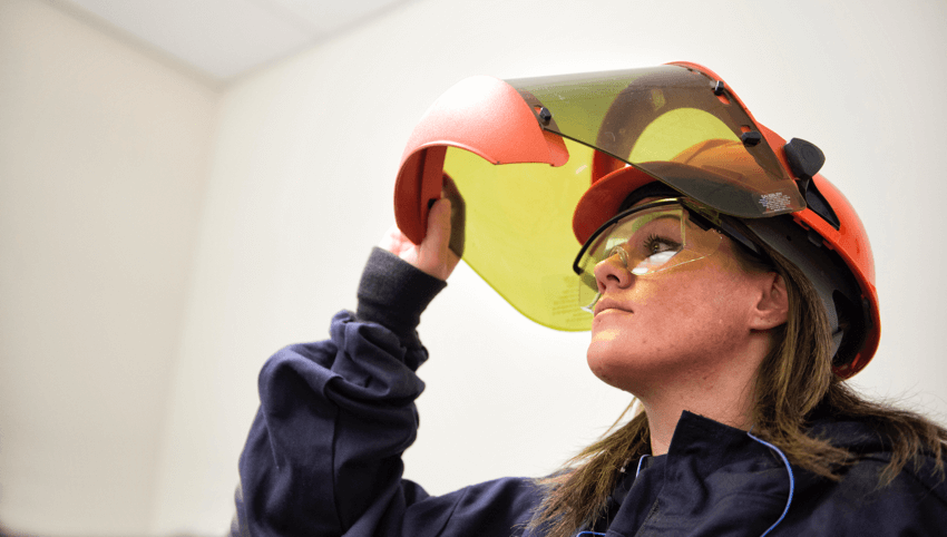
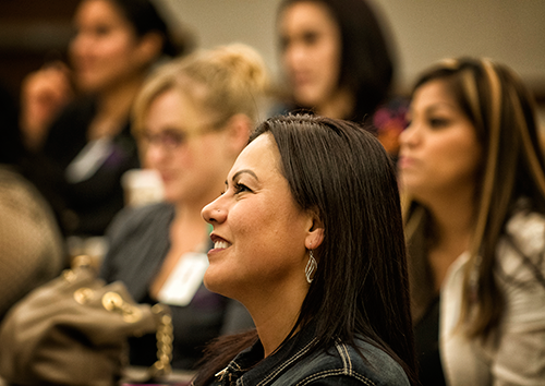
Image and Text (Left Aligned)
This is what the left aligned image and text looks like with dynamically cropped selected.
Notice how "tall" the image becomes, as it is forced to match the height of the text in this column. The more text you add, the taller the image will have to be.
So, maybe don't use the "Image and Text" section type if you have many paragraphs of text in the section. Use a plain "Text Section" instead.
Want to see something interesting? Use the Inspect dev tool to view this page as if it were seen on a phone (or make your browser window tall and skinny to look phone-like). Notice how the image is now above the text and landscape mode. Neat, huh?
Optional quote of the "Image and Text" sectionOptional button Another one (still part of "Image and Text")
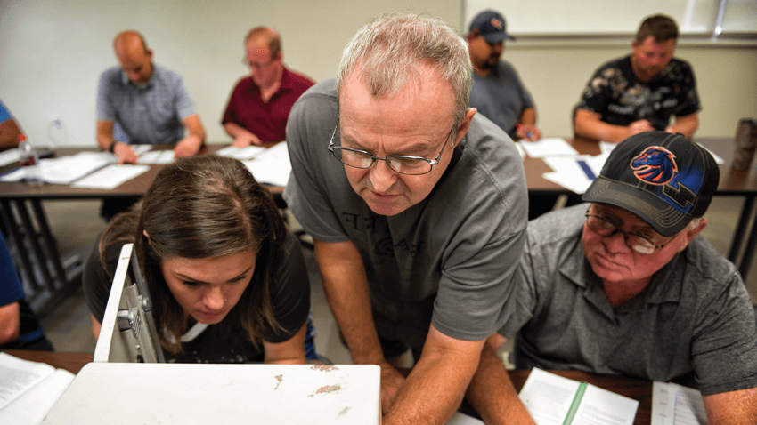
Image and Text (Right Aligned)
This is what the "Image and text section" looks right right aligned without dynamic cropping.
If the adjacent text grows too long, the image appears as if it is floating disconnected to the side.
Again, switch between desktop and phone screen views to see how differently the images are displayed depending on the viewer's screen size.
OPTIONAL BUTTON! OPTIONAL BUTTON 2; please keep button text short and action-oriented because long buttons look bad and are often mistaken as ads"Simplicity speaks louder—clear, concise design draws users in and keeps them engaged."
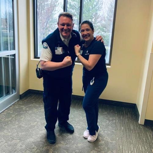
Testimonial Section
-
I wasn’t sure what I wanted to do after graduation, but this career prep class gave me the direction I needed. It helped me build a strong resume, practice real interview skills, and figure out what kind of job would actually make me happy. The instructor was super supportive and made everything feel doable. I walked away feeling confident, prepared, and excited for what’s next. Honestly, every student should take this class before entering the workforce.
Column 2
This is how the text is displayed in the columns when no other optional elements are included. Just heading and text.
Column 3 (optional image chosen)
This is how the text is displayed in the columns. Options are chosen for each column individually. Optional Call to action (button version)Image tiles
Optional Text section for image tiles. Minimum of 1 tile must be made with this option.
Icon Columns (4)
Required text. Here I chose the wrench Icon. All 4 icons must be chosen with information filled out
Optional call to action (link required)Icon columns (6)
This works the exact same as Icon columns 4, except there is 6 now
Optional call to actionIn publishing and graphic design, Lorem ipsum is a placeholder text commonly used to demonstrate the visual form of a document or a typeface without relying on meaningful content. Lorem ipsum may be used as a placeholder before final copy is available. It is also used to temporarily replace text in a process called greeking, which allows designers to consider the form of a webpage or publication, without the meaning of the text influencing the design.
In publishing and graphic design, Lorem ipsum is a placeholder text commonly used to demonstrate the visual form of a document or a typeface without relying on meaningful content. Lorem ipsum may be used as a placeholder before final copy is available. It is also used to temporarily replace text in a process called greeking, which allows designers to consider the form of a webpage or publication, without the meaning of the text influencing the design.
In publishing and graphic design, Lorem ipsum is a placeholder text commonly used to demonstrate the visual form of a document or a typeface without relying on meaningful content. Lorem ipsum may be used as a placeholder before final copy is available. It is also used to temporarily replace text in a process called greeking, which allows designers to consider the form of a webpage or publication, without the meaning of the text influencing the design.
In publishing and graphic design, Lorem ipsum is a placeholder text commonly used to demonstrate the visual form of a document or a typeface without relying on meaningful content. Lorem ipsum may be used as a placeholder before final copy is available. It is also used to temporarily replace text in a process called greeking, which allows designers to consider the form of a webpage or publication, without the meaning of the text influencing the design.
Thats a whole lot of icons
Three Columns and a CTA
Optional text before the columns
Three Columns and a CTA 1
Required text looks like this for each column
Three Columns and a CTA 2
Required text looks like this for each column
Three Columns and a CTA 3
Required text looks like this for each column

This is the FAQ Section?
Yes this is the FAQ section and this is the text section answering the questionCan Multiple Questions be Asked?
Yes multiple questions can be created and answered.Is This Everything there is to the FAQ Section?
Yes, what you see is all that the FAQ section doesOptional Heading Accordion section
Accordion Heading
Multiple Accordions
Large sponser
Heading
Text talking about sponsors. Multiples of each type of sponser can be created or only Use the first sponsor type to be able to add a description as seen here.Optional Medium Sponsor
Label for Logo
Optional Small Sponser
Label for the small sponer logo
Contact Section Heading Text with Optional Sections Filled In
Optional text for the "Contact "Section". You can add a short intro paragraph here.
Optional buttonOptional subheading for the contact card section
 Full Name Here
Job Title
Email: Email@email.com
Phone: (208) 123-1234
Office: Building H, Room 1123
Schedule a Meeting
Sue ExampleuserWorker
Email: Email@email.com
Phone: (208) 123-3456
Office: Builders Building
Schedule a Meeting
Contact Section Heading Without the Optional Stuff
Full Name HereJob Title
Email: Email@email.com
Phone: (208) 123-1234
Office: Building H, Room 1123
Schedule a Meeting
Sue ExampleuserWorker
Email: Email@email.com
Phone: (208) 123-3456
Office: Builders Building
Schedule a Meeting